RUA Design System

VISUAL IDENTITY GUIDELINES

Guides for maintaining design structure and accessibility throughout digital presentation and branding.

Logo: RUA has four different brand marks. Instructions for their use are below.

Fonts and Text Hierarchy guidelines for web, digital presentations and print materials.

Color: The RUA Color Primary and Secondary Palettes and approved Gradients.

Design Philosophy

The logo and overall visual identity aesthetic for Research University Alliance (RUA) primarily serves accessibility, inclusivity and usability while drawing on inspiration from the visual systems of research data expression.

The RUA visual design system is audience and user oriented. Usability across digital platforms is a key prerequisite. And so assets must incorporate adaptable features and a design strategy that allows for flexibility and multi-format integration.

One of the key parts of RUA engagement is centered on professional development training and resources so the visual identity works as a model for demonstrating professional proficiency in digital communication and design strategy, signaling an understanding and integration of contemporary presentation and communication standards and best practices.

Accessible Design

RUA’s goal is to make online content and communications accessible to everyone by utilizing a visual design system that is audience and user oriented. 

The RUA logo, typography styles, and color palette used in accordance to the visual identity guidelines results in a design system that meets the following accessibility standards:

Applying Color

  • Use color with care
  • Optimize contrast using the RUA Web Color Palette
  • Do not rely on color alone to convey meaning
  • Double check new assets with Adobe Color Contrast Analyzer
  • Check to make sure website color elements and images are darkmode compatible

Text and Type

  • Use Text Hierarchy Heading Styles
  • No reliance on color or sensory characteristics alone to convey meaning
  • Use of color combinations that provides a sufficient degree of contrast
  • Use of text instead of images of text
  • No use of moving, flashing or blinking text
  • Text line spacing and lead values meet accessibility standards

Interactive Elements

  • Controls for audio playback
  • Controls for video playback
  • Use of text instead of images of text
  • No use of flashing or blinking elements
  • No focus changes without user initiation
  • Consistent navigation and identification of elements
  • Descriptive Links
  • All Images have comprehensive Alternative Text Descriptions

Adaptable Assets

To serve a dominantly digital communication strategy, the RUA design system works as a visual language.  When the following guidelines are applied consistently and universally, content is scannable and easily understood.

The logo variations – logo symbol, word-mark, acronym, and icon – support an adaptive design strategy and are formatted to best suit the technical specifications of a broad range of branding materials and delivery mediums.


Typography

Font Selections are oriented on an accessibility first presentation style.  They provide a high level of legibility.  San Serif type combinations speak to precision and future forward design aesthetic.

Color Palette

The RUA color palette is an accessible color palette that is in compliance with current WCAG standards.  The color system comprises the Primary Web Color Palette, the Secondary Color Palette, the proscribed tint and shade schema, and the approved gradients set.  All design assets have been checked using the Adobe Color Contrast Analyzer.  To ensure that new content meets accessible design standards, check text and background color contrast before publishing if the design utilizes color text and/or a color background.

Use Photoshop to Create Visual Assets

Graphic design experience and fluency with Adobe Photoshop and  InDesign are recommended prerequisites for creating new visual assets that are in line with the RUA Visual Identity Guidelines and Accessibility Requirements.

Photoshop is recommended for creating new graphics and designs using the asset files provided. The svg files are compatible with both Photoshop and Illustrator. The RUA color palette is an accessible color palette that is in compliance with current WCAG AA standards. The color system comprises the Primary Web Color Palette, the Secondary Color Palette, the proscribed tint and shade schema, and the approved gradients set. All design assets have been checked using the Adobe Color Contrast Analyzer. To ensure that new content meets accessible design standards, check text and background color contrast before publishing.

Typography

Color Palette

Logo + Color

TYPOGRAPHY

RUA Typography and Text Hierarchy

Font Selections are oriented on an accessibility first presentation style. They provide a high level of legibility. San Serif type combinations speak to precision and future forward design aesthetic.
Text hierarchy and heading structure provide a visual language that enables the reader to scan and easily take in the order of importance of the information being presented.

Primary Font: Noto Sans SC

The primary font is used as the heading and title style for web and print. The specific font size and style for each heading is designated in the Text Hierarchy.

Secondary Font: Work Sans

The secondary font is used mainly for the paragraph or body designation in the text hierarchy. Work Sans was chosen for it’s clear lines and like characters, such as lower case l and capital I, being visibly different. This is important for readability and accessibility

Accent Font: Cormorant Italic

In the RUA design system the accent font is used as a subtitle, tagline, bulletin/list, quote section, testimonial, and by-line in digital and print presentation.

Typography

Primary Font:
Noto Sans SC

Noto is a font family that aims to support all languages in the world. Noto has multiple styles and weights, and is freely available to all. Noto Sans allows for content to be seamlessly translated into all languages.

Typography

Secondary Font:
Work Sans

Work Sans is a Variable Font. Features are simplified and optimized for screen resolutions; for example, diacritic marks are larger than how they would be in print. The Regular weight and others in the middle of the family are optimized for on-screen text usage at medium-sizes (14px-48px). The fonts closer to the extreme weights are designed more for display use both on the web and in print.

Typography

Accent Font:
Cormorant Italic

Cormorant is an open source display font family. Hand drawn and inspired by the classic serif Garamond heritage, Cormorant provides a classic print aesthetic with a more open appeal for the digital space and high definition scalability.

'Cormorant Italic' in the cormorant italic style to demonstrate accent type sample. White on transparent background.

Text Hierarchy

Text hierarchy and heading structure provide a visual language that enables the reader to scan and easily take in the order of importance of the information being presented.

Providing a visual guide for the reader to move through the information, in a way that is intuitive and streamlined, makes it easier to read and understand.  

Maintaining consistent and accurate text hierarchy html tags is also important for meeting web accessibility guidelines, as they provide important structural cues used by site readers and other accessibility support systems.

COLOR PALETTE

RUA Colors

The RUA color palette is an accessible color palette that is in compliance with current WCAG standards. The color system comprises the Primary Web Color Palette, the Secondary Color Palette, the proscribed tint and shade schema, and the approved gradients set. All design assets have been checked using the Adobe Color Contrast Analyzer. To ensure that new content meets accessible design standards, check text and background color contrast before publishing if the design utilizes color text and/or a color background.

RUA Primary Web Colors

RUA Black, White, Cloud, Grey and RUA Blue are the core color group for RUA information Design. These colors used according to visual identity guidelines optimize contrast and web accessibility.

  • RUA Blue is set as the global accent color for the WordPress theme dynamic style systems.
  • Typography Heading Heading Styles: Use black for heading styles
  • Heading Accent: Use RUA Blue to accentuate keywords in a heading.
  • Use RUA Blue as fill for interactive buttons on a white background or Cloud Grey background.
  • Cloud Grey is used to provide light contrast to modules within a section.  Visually breaking up large blocks of information into more digestible portions
  • Alternate Section Backgrounds between RUA Black and White to optimize contrast and changes in topic.
  • Text is always White on RUA Black background or Black on White/Cloud Grey Background.
a

RUA BLACK

HEX: #202020
RGB: (32, 32, 32)
CMYK: 72, 66, 65, 74
LAB: 12, 0, 0
HSB: (0, 0, 13)

a

WHITE

HEX: #FFFFFF
RGB: (255, 255, 255)
CMYK: 0, 0, 0, 0
LAB: 100, 0, 0
HSB: (0, 0, 100)

a

CLOUD GREY

HEX: #FAFAFA
RGB: (250, 250, 250)
CMYK: 1, 1, 1, 0
LAB: 98, 0, 0
HSB: (0, 0, 98)

a

RUA BLUE

HEX: #227C9D
RGB: (34, 124, 157)
CMYK: 84, 41, 26, 2
LAB: 48, -18, -26
HSB: (196, 78, 62)

Secondary Colors

The Secondary Color Palette is made up of Soft Red, Light Sand, Sun Gold, New Green.  RUA Blue is meant to be used both with the Secondary Color Palette as well as the primary accent color for the RUA WordPress site theme’s dynamic style systems. 

The secondary color palette translates primary colors into a softer vibrant color set that stands out and provides an excellent foundation for creating designs with accessible color contrast. 

When to use secondary colors:

  • Accent Colors
  • Data Visualization and Charts
  • Special Interactive Elements such as Calls to Action or Event Landing Page with customized color theme.
  • Presentation Design System: Assign Accent Colors to each major topic so it is visually apparent where you are in your presentation as the slides progress.


  • Illustration and Graphic Design
  • Photo and Image Overlays 
  • Print Design: Posters, Programs, and Reports
  • Environment Design
  • Gradient Texture Backgrounds
a

SOFT RED

HEX: #FE6D73
RGB: (254, 109, 115)
CMYK: 0, 73, 43, 0
LAB: 65, 57, 26
HSB: (358,57,99)

a

LIGHT SAND

HEX: #FEF9EF
RGB: (254, 249, 239)
CMYK: 0, 1, 5, 0
LAB: 98, 0, 5
HSB: (40, 6, 99)

a

SUNGOLD

HEX: #FFCB77
RGB: (255, 203, 119)
CMYK: 0, 22, 62, 0
LAB: 85, 12, 49
HSB: (37, 53, 100)

a

NEW GREEN

HEX: #17C3B2
RGB: (23, 195, 178)
CMYK: 70, 0, 39, 0
LAB: 71, -44, -3
HSB: (174, 88, 76)

Using Tints, Shades, and Tones

Using the tints, shades and tones of the primary and secondary palette expands design capacity and is particularly useful in creating robust data visualizations and graphic illustrations, as well as establishing a visual information hierarchy in reports and presentations.  Typically darker shades convey weight and importance, while hues indicate clear transitions from one topic to the next.  Tints are often used as a light visual indication/reminder of the topic/section.  Gradients are used to illustrate a natural progression of ideas.

The guides for using the Tints, Shades, and Tones of the RUA Color Palette are as follows:

1. Tints: use white to lighten a color:

To create tints of the RUA Color Palette, add white to the color in increments of 10% to lighten the color.

2. Shades: use black to darken a color.
To create shades of the RUA Color Palette, add black to the color in increments of 10% to darken the color.

3. Tones: use gray to mute a color:

To create tones of the RUA Color Palette, add grey to the color in increments of 10% to mute the color.

LOGO

RUA LOGOS

The RUA LOGO set is designed to optimize the universal digital formats. The majority of screens and viewing schema use a 16:9 horizontal format or the 9-16 vertical format. Previews and thumbnails are often square.

The logo files provided are default 16:9, 9:16, or 9:9 so that they can easily be used on web platforms and in video and slide decks. The RUA Primary Logo is the Circle with the Research University Alliance spelled out. Legibility is a priority and so the type is bold and streamlined. This should be the default logo used for brand identification.

The RUA Circle logo is a square format and should be used as a profile image for online accounts where the Research University Alliance appears as part of the profile title. This allows for an accessible avatar that fits most platform profile image specifications.

The RUA Acronym logo is intended for use on the website, presentation slide decks, zoom backgrounds, and any instance of repeating brand presence throughout multiple screens and/or pages.

The RUA Circle positioned above the Acronym is an alternative to the primary RUA Wordmark. It is intended to be used where a vertical format is necessary, with the condition that the full Research University Alliance title is present in accompanying communication text and/or title structure.

RUA Primary Logo

The primary logo is the circle symbol and the full Research University Alliance title spelled out using the set RUA typography.

The primary logo should always be used unless the primary logo is not compatible with the image requirements of an online platform.   In which cast the logo variation that best fits the image specifications should be used.


RUA Logo Variations

The RUA primary logo is the circle symbol with Research University Alliance spelled out.

The logo variations are:
1. The RUA Circle Symbol
2. The RUA Acronym Symbol
3. The RUA Circle + Acronym together

Logo variations are designated for use on the RUA website, social media platforms, and digital presentation formats including streaming and video.
1. The RUA Circle Symbol
The RUA Circle Symbol should only be used as a profile image for RUA accounts on social and digital platforms.
2. The RUA Acronym Symbol
The RUA Acronym is primarily designated as the logo used on the RUA website and as an option for RUA branded slide presentations.
3. The RUA Circle + Acronym together
The vertical format of the RUA Circle + Acronym logo variation is intended for mobile 9:16 presentation: social media posts and videos intended for distribution across multiple digital channels and platforms.

RUA Circle + Acronym

RUA circle logo symbol.

RUA Circle Logo

Using the RUA LOGOS

Clearance Space + Minimal Logo Size

Clearance space ensures the distance from other design elements that surround the logo so that the logo is visible and readable. The guide below specifies the minimum clearance pace allowed to meet accessibility goals. Using more clear space is always recommended as it increases the visibility and impression on the audience.

Clearance guides are available for download as transparent png files.  Drag and drop the guide for the logo you are using into your photoshop canvas / design document.  Size the clearance guide to the space you would like to place the RUA logo using the transform tool.  Then size the logo to fit inside the guides as shown below.

Always keep in mind the minimum size for each logo and make sure your layout fits both size and space requirements for using the RUA logos.

Using the RUA LOGOS

Minimum Clearance Space

In order to preserve the legibility of the RUA logos, it is important that no other logos, type or other graphic elements infringe on the space surrounding the logos including the minimum distance between logos and the edge of a format, screen or document. The minimum clearspace is equal to the width and height of 1/5 of the height of the RUA circle in the logo mark or 1/5 of the RUA Acronym logo height. See logo grid images for reference.

Using the RUA LOGOS

Minimum Distance

In order to maintain the readability and recognition of the logo mark, the may not be sized smaller than the height and width specified for each logo. Be sure to maintain the proper proportions when scaling a logo.

Minimum Logo Clearance Space

Primary Logo

1/5 of the height of the RUA circle in the logo mark. The clearance space can never be less than 36 pixels.

Circle Logo

1/5 of the height of the RUA circle in the logo mark. The clearance space can never be less than 36 pixels.

RUA Acronym

1/5 of the height of the RUA Acronym in the logo mark. The clearance space can never be less than 36 pixels.

Circle + RUA Logo

1/5 of the height of the RUA circle in the logo mark. The clearance space can never be less than 36 pixels.

Minimum Logo Size

Primary Logo

Width: 160 px

Height: 70 px

Circle Logo

Width: 120 px

Height: 120 px

RUA Acronym

Width: 160 px

Height: 70 px

Circle + RUA Logo

Width: 70 px

Height: 100 px

LOGO + COLOR

RUA Primary Color Expression

The primary color expression for the RUA logo marks is a gradient using Soft Red, Sun Gold, New Green, and RUA Blue.

As the gradient visually blends one color into another, it symbolizes the ability to progress and acquire knowledge, dissolving boundaries and barriers of exchange. It is the graphic embodiment of exchange and transformation.

Decorative image: the RUA primary color expression for the RUA logo marks is a gradient using Soft Red, Sun Gold, New Green, and RUA Blue. In this image the color progression begins with the blue on the left side of the screen.
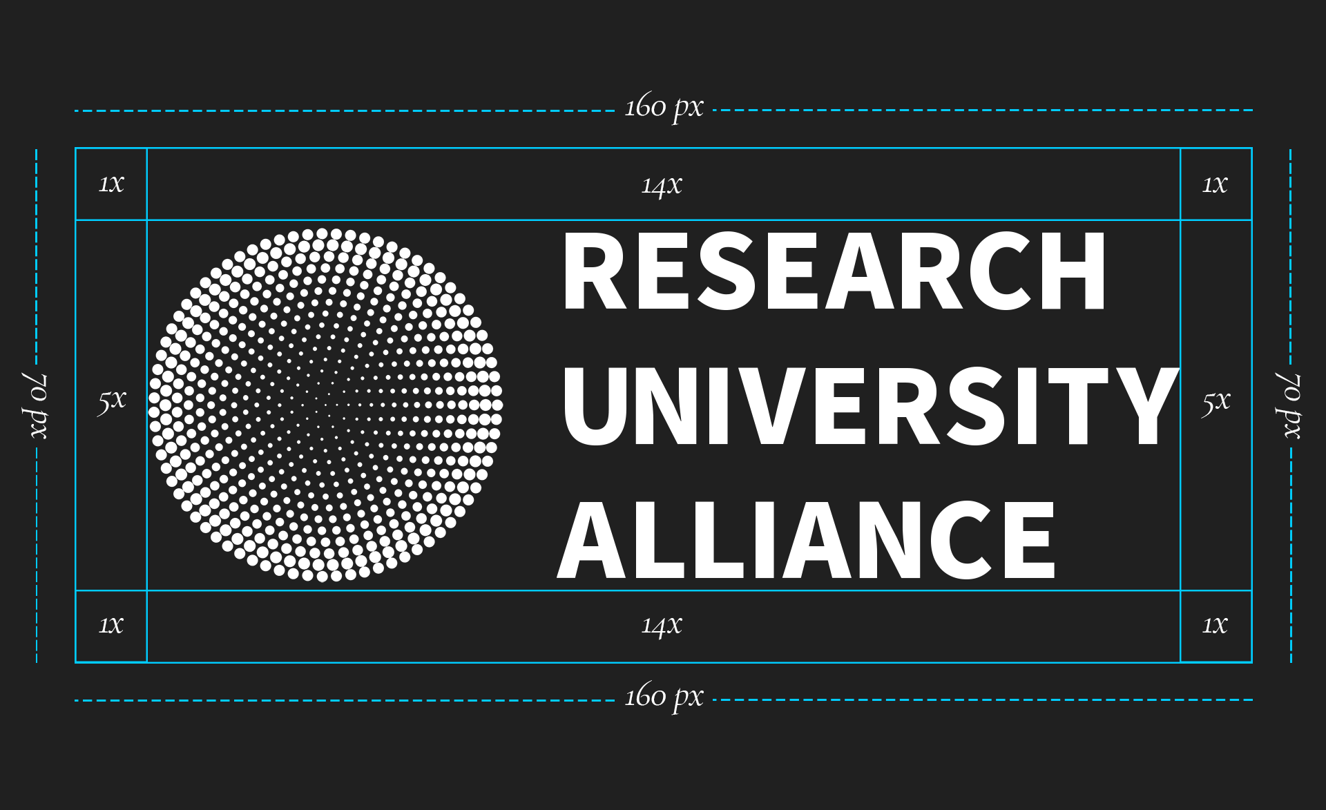
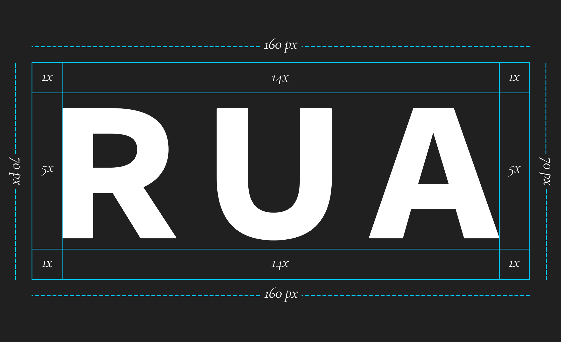
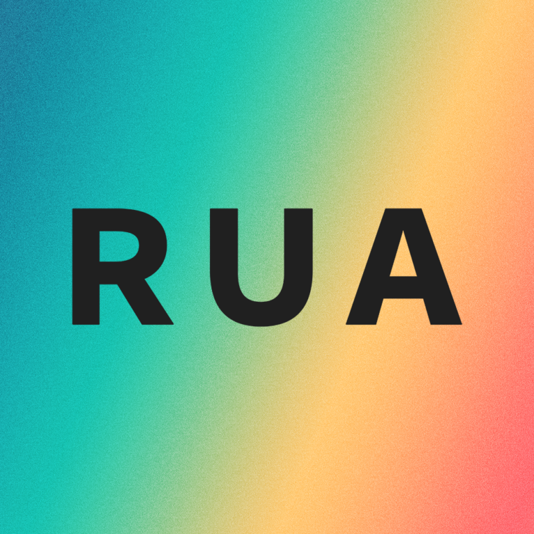
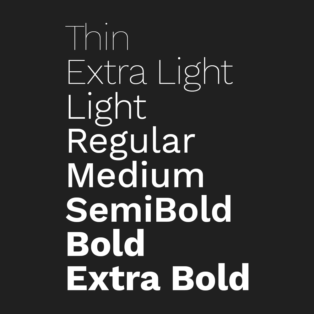
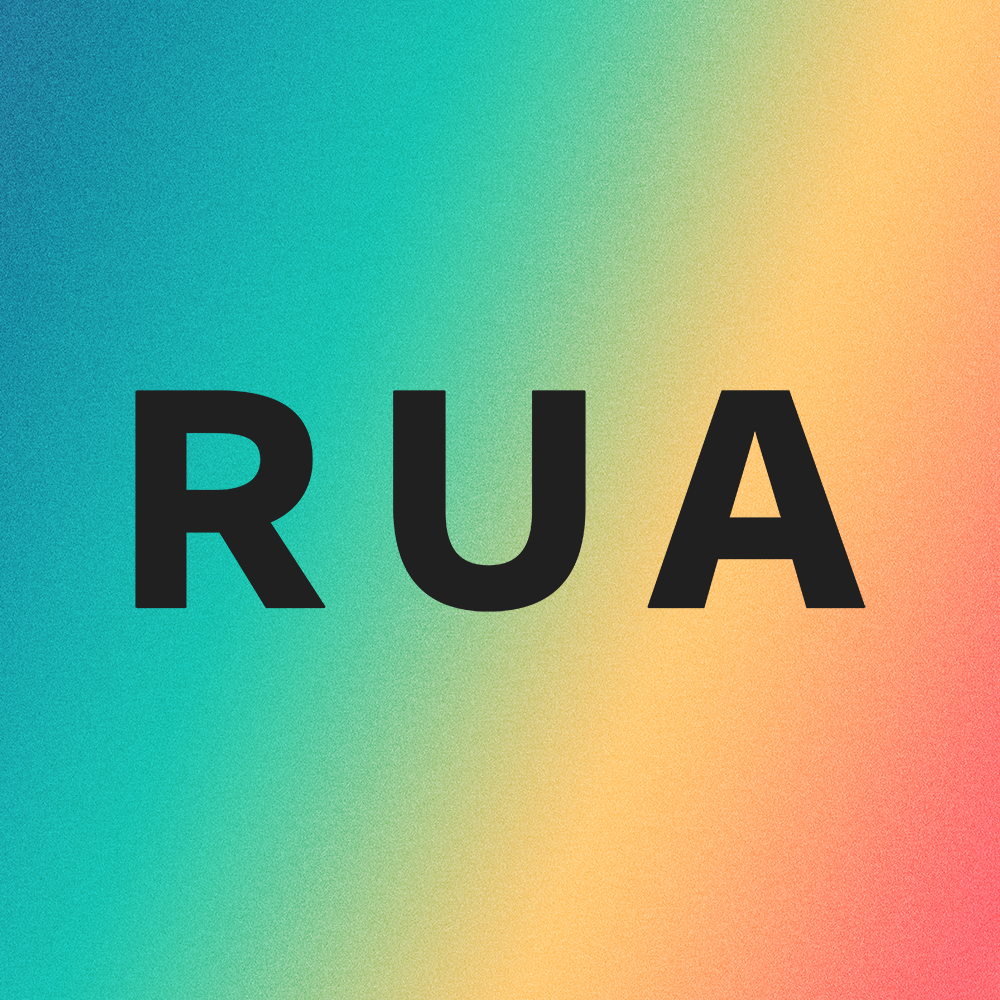
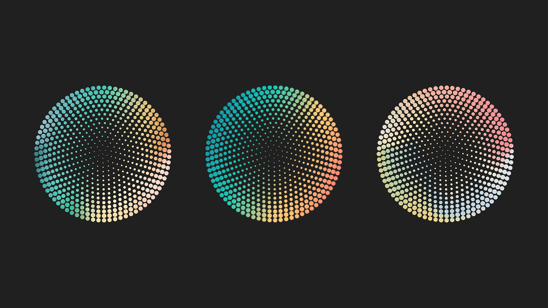
Gradient 1 - The Primary RUA Gradient

When using the primary gradient as background for text, text must utilize a style of H1, H2, or H3. The text color must always be white. The text must always be placed horizontally aligned so that it is placed over the RUA blue side of the gradient. These guidelines meet accessibility standards.

1

Alternative Color Expressions

There are two alternative color expressions available for use when the logo is paired with one or more of the symbols representing the Research Exchange, Professional Development, the Postdoc Concierge, and/o the Postdoc Portal that are set in the RUA Design System.

The gradient variations are:

Gradient 2: The RUA Tonal Gradient blends the RUA Gradient with a tonal texture.
Gradient 3:  The RUA Complementary Gradient blends the RUA Gradient with a texture using complimentary hues.
Gradient 4:  The RUA Tinted Gradient blends the RUA Gradient with a tinted texture.

Gradient 2

Tonal Gradient Texture

2

Image of the RUA Visual Identity AlternativeGradient Color 3
Gradient 3

Complimentary Gradient Texture

3

Image of the RUA Visual Identity Alternative Gradient Color 4
Gradient 4

Tinted Gradient Texture

4

DESIGN SYSTEM

RUA Design System

The core communication channels and engagement platforms for the Research University Alliance are the Research Exchange, Professional Development, the Postdoc Concierge, and the Postdoc Portal.  In order to create clear visual navigation cues and scannable information design, the following graphic symbols have been created and assigned to these four pillars of RUA outreach.  These four symbols used with the RUA logo variations, color palette, and typography make up the RUA Design System.

Research Exchange

Symbol

Professional Development

Symbol

Post Doc
Portal

Symbol
Decorative Symbol for the Postdoc Concierge. Image shows three diamond squares - nested in decreasing size and colored in coral, yellow, blue and green gradient pattern.

Post Doc Concierge

Symbol

DO'S + DON'TS

Do's and Don'ts for Logos

In order to maintain the RUA visual identity in an accessible and recognizable way, please do not do the following when creating content with the RUA color logo variations.

Do Not Use Solid Colors

Do not express the logos in solid colors. The correct color expression for all logos is one of the approved gradients in the design system.

Do Not Use Color Logos on Color Backgrounds

Only use the logo in RUA Black (#202020) on approved color backgrounds. Any new color background must pass the color accessibility guides.

Ensure Visibility

Make sure that the color logo is visible using minimum clearance space and size specifications. If it is hard to read then use the black and white logo version.

Do Not Use Effects on Logos

Do not use any shadow, glow, embossing, overlay, outline or stroke effects on the logos. When using the color logos, use the approved logo files available for download.

Do's and Don'ts for Icons

In order to continue to maintain the level of accessibility when creating new content for the RUA website, use the following guidelines when sourcing icons to use in the icon widget and/or as a featured image.

Do Not Use Multiple Colors

Do not use multicolored icons. The correct color expression for all icons RUA Black on a white background if the icon is being used in the Icon function within the site. Or if the icon is being used in the design system or as a featured image for a post then the icon should be RUA Black on a color background that passes the color contrast test for accessibility.

Do Use Filled or Weighted Icons

Only use the logo in RUA Black (#202020) on approved color backgrounds. Any new color background must pass the color accessibility guides.

Ensure Visability

Make sure that the color logo is visible using minimum clearance space and size specifications. If it is hard to read then use the black and white logo version.

Do Not Use Effects on Logos

Do not use any shadow, glow, embossing, overlay, outline or stroke effects on the logos. When using the color logos, use the approved logo files available for download.

Top